Aesthetic Charm
The visuals in Stellaris are well done, giving just the right amount of detail without being distracting. Stars flare, space-borne aliens pulsate, and black holes look pretty cool as well although I still get a bit worried about sending my science vessel to scan them. Space battles can look very epic too, as your ships swarm (or are swarmed by) the enemy fleet, with lasers flashing and missiles arcing towards their targets. While in a system, you can zoom in or out as you please, although the maximum zoom doesn’t seem to have any purpose other than checking out the pretty graphics and animations.
UI is a crucial element in 4X games, as it has to present a huge amount of information in a way that feels intuitive. The main screen HUD is the core of the UI, and i think Stellaris pulls it off pretty well. It only took half an hour or so to become comfortable with the various icons and displays. The menus and sub-menus take a little while longer to learn. I still find myself looking for the leader menu in all the wrong places, but then I don’t exactly have the “Quick Learner” trait. Nevertheless, most things can be accessed with 2 clicks.

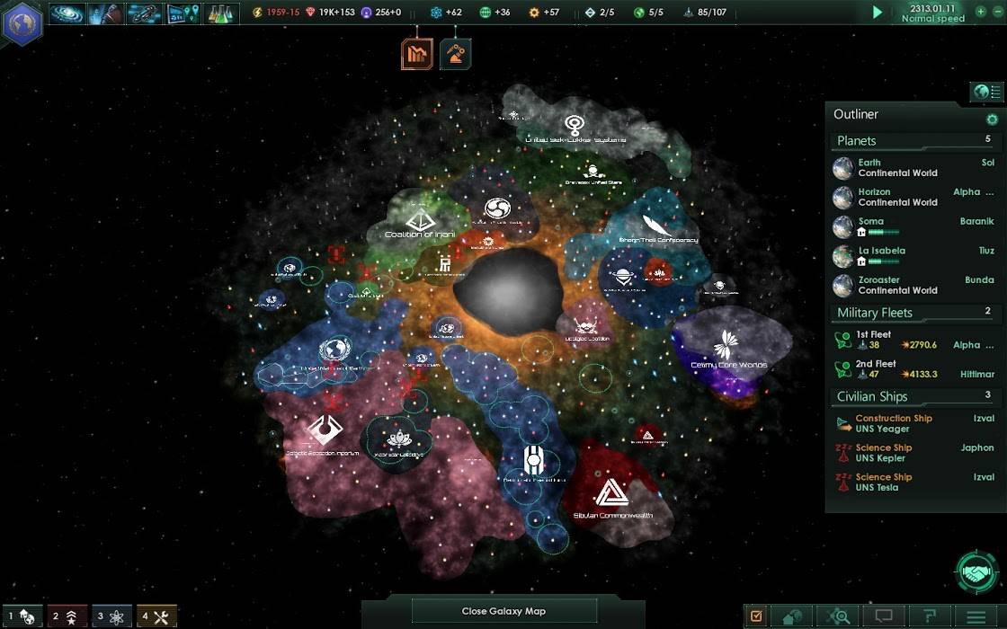
It’s starting to get crowded.
The galaxy map serves as an overview of your surroundings, displaying resources, fleets, territories, and potentially habitable worlds. Conveniently, a lot of commands can be issued by right clicking on systems from here, which makes managing your empire a little easier. While the galaxy map helps you keep track of things, I get the feeling that it could become very cluttered in the late game, with fleets roaming everywhere. An option to toggle between map information overlays, similar to that in Crusader Kings and Europa Universalis, would improve this. All in all, the UI isn’t perfect. Certain tasks can be cumbersome or unintuitive but I think that’s a symptom of the sheer depth of the game. But you can look forward to mods or updates that iron out some of the kinks.
The audio in Stellaris is fittingly minimalistic. Different types of notifications have their own alert sounds, which help you direct your attention appropriately. A “finished building” notification can wait, while an “encountered enemy fleet” notification is something you might want to address right away, and the notification sounds help distinguish these.
The music in Stellaris is very well conceived, and adds to the atmosphere. It uses a lot of spacey, unobtrusive synth similar to the music in EVE Online, but with a more rhythmic structure. There are also some epic orchestral themes in there, which do well to evoke the grandeur and mystery of space. I tend to mute the music whenever I play a 4X game so I can focus, but I haven’t done that with Stellaris. The music walks the fine line between engaging and distracting.
Final Thoughts
Initially, I wasn’t too sure about Stellaris. As a big fan of other 4X games like the Civilization, Crusader Kings, and Europa Universalis franchises, I found a lot of attraction in the historical aspect. For me, much of the fun came from rewriting history whether as the leader of a lowly steppe tribe, or the Doge of Venice. I didn’t feel that playing as some made up race in a mostly made up galaxy would be as appealing.

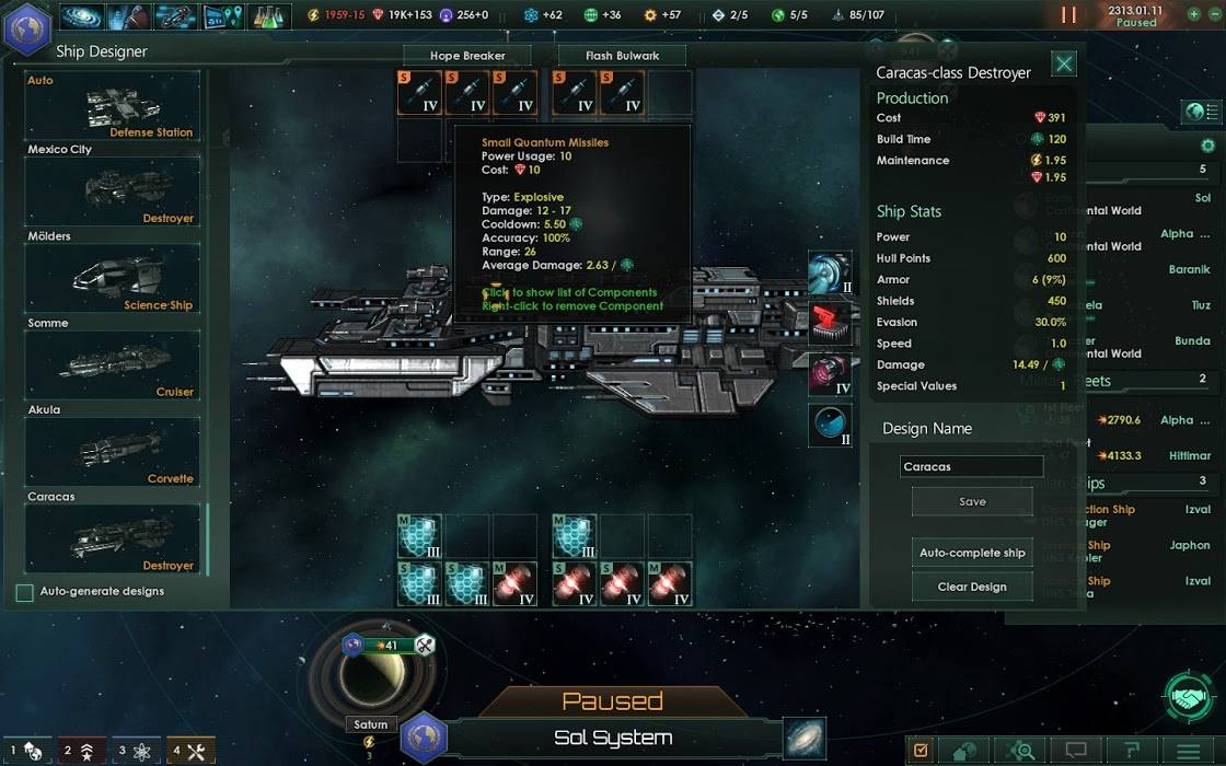
Ship fitting is always fun.
Stellaris won me over with its great depth. At the start of a playthrough, you really feel like the galaxy is your oyster, that anything could happen. For all the little complaints about unclear UI, or shallow enemy AI, the fact remains that there’s just so much to do. Even just learning about everything that’s possible could take a good ten to twenty hours. The difficulty curve isn’t steep, but it is long; and once you’ve mastered the single player game, you can face human opponents in multiplayer.
I strongly recommend Stellaris to any 4X/grand strategy fans who love complexity, and with Paradox Interactive’s tendency to add features for years to come, it’s just going to get better.
(Note: Paradox Interactive have published on their dev blog that they’re listening to the community’s feedback and are spending the coming months working on adding more content and tweaking the UI)
Score

4 stars – a brave and successful transition from historical strategy to space
![]() Pluses:
Pluses:
- A huge game with a lot of strategic depth
- Beautifully made soundtrack that doesn’t distract
- Multiplayer option so you can test your wits against humans
![]() Minuses:
Minuses:
- UI isn’t quite as intuitive as it could be
- Some tasks can get monotonous